This article is co-authored by Tory Madden, University of Cape Town, South Africa, and Peter Kamerman, University of the Witwatersrand, Parktown, South Africa.
Editor’s note: In this discussion, two pain scientists tell the story of their first foray into “open science” practices. Peter Kamerman and Tory Madden wanted to try out tools that would increase the transparency of their research practices and also support their collaboration, so they committed to doing so over the course of two projects. Here, they reflect on their process in the hope that sharing their halting, uncertain journey will encourage others to also dip their toes into the water of open science practices.
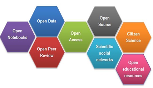
The term “open science” sounds welcoming, don’t you think? Yet in a recent blog post, “I hate open science,” Tal Yarkoni bemoans the term for its vagueness. Figure 1 below shows that open science covers a very broad range of initiatives, from open notebooks (lab books) to citizen scientist activities. Where do we start?

One facet of open science is to make research reproducible, which requires the aspects of open data, open access, and open source. That means we not only need to describe our methods very clearly and in great detail, but we also need to make sure that anyone can check the assumptions and processes we used to analyze our data, from cleaning the raw data through to plotting figures for publication. We need to make available our raw data and the scripts we used to run the analysis. Finally, by making our manuscripts openly available, we allow others to see the conclusions we have drawn and whether these conclusions are consistent with our analytical methods.
We recently started our own uncertain stumble along the path toward such reproducibility. We chose to collaborate on the analysis of two datasets. We live in different cities, more than 1,000 kilometers apart, so we needed to find systems that would smooth the process of working on the same datasets. The old point-and-click approach to data analysis would never work; we needed something script based so that we could tweak things as we went along without losing track of previous work. Pete was already teaching with the statistical software “R”; Tory had never used it and was downright scared of it. (All that syntax? Terrifying!) Pete knew about git and GitHub for keeping track of changes to documents, but had never used them for collaboration; Tory had never even heard of them. (And who even thinks of these wacky names?) We both knew of figshare (for sharing data, figures, etc.) and pre-prints (public postings of early versions of manuscripts before they are peer reviewed), but neither of us had used them. A learning journey was about to begin! We would need to learn new skills, become familiar with new systems, and then take the scary step of making everything we had done available to public scrutiny (bringing new meaning to the “Naked Scientist”).
Here are our reflections on the process:
Peter: I started using R because it is free, open source, and I saw the awesome plots people were producing using the software. Plotting was all I used R for at first. I wrangled my raw data into clean data in Excel, did my analysis using point-and-click programs such as GraphPad Prism, and then did my plots in R (yes, I know GraphPad Prism is great for plotting, but I wanted the clean lines and beautiful color options of an R plot). It’s a bit intimidating at first to have to start a plot with nothing except a blank screen, and you have to type stuff to tell the software what you want. The first few times, it took me ages just to get the data into R. But there are so many online resources that figuring stuff out as I went along wasn’t too difficult and was pretty empowering (the online community for R is massive, and they are very helpful). Indeed, it was through these online communities that I learned about the open science and reproducibility philosophies, and how R is a great platform for achieving the goals of these movements. Using R, you write down every step of your analysis, so everyone can see what you have done. This code is interpreted by the software, running your analysis and plotting your figures. To make your code more human friendly, you can write notes using a basic text language called RMarkdown. R then collates all this information into beautiful reports.
By the time I started collaborating with Tory, I was using R for every stage of my data analysis and reporting (no more Excel or GraphPad Prism). I even had started my own blog entirely made using R and RMarkdown. But now it was time to take these skills to the next level by using them for what they were intended to do: collaborative data analysis.
On my insistence, Tory and I started the collaboration using R and tools such as git/GitHub (Tory explains more about this cool but often very frustrating system designed for collaborative coding). I still don’t know why I insisted we go this route. Tory was an R novice, and I had never used R or git/GitHub for collaborative purposes, so we were flying by the seat of our pants most of the time. There were numerous “what the hell?” Skype calls and emails between us as we bumped into cryptic error messages and seemingly wacky software behavior. Yet after only one week, we had bashed out an extensive piece of the core analysis and were on our way to sharing our findings with our collaborators around the world.
Tory: I had loads of new skills to learn for this project. I felt intimidated at first, but once I was fledged with using R and git/GitHub (I did a short course with Pete, and there are plenty of free resources online), I quickly felt increasingly excited about it. R allows you to write a script that runs your analysis from start to finish. R comes with really handy extensions that, with the click of a button, seamlessly allow you to automatically “print” your script and the results to an HTML output so that the script and results can be viewed in a web browser. That made it SO much easier for us to discuss the results and plots with other members of the project's research team, who were spread as far apart as South Africa, Australia, and the US. Making any changes to the script is pretty quick, too—I loved knowing that I no longer had to start the whole analysis again as I would have in a point-and-click program such as SPSS. We could update plots of the data in the middle of a Skype meeting so as to visualize our data differently, which made things very efficient. For publication, we could just as easily produce copies of all our analysis code and results as PDF files instead of HTML pages—ready-made supplementary files.
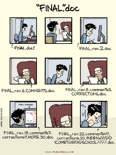
git/GitHub has been a bit more tricky to get the hang of, but I’m persevering because, when I can use it well, it’s wonderful. It’s a “version control” system that holds the whole study folder in a private, online location, so that any of us can access the contents and make updates to the scripts. It records what updates are made and when, and if someone makes a mistake, it’s possible to ”rewind” to a previous version of the study folder. This means no more folders filled with a mess of versions of the document you are working on (Figure 2). Using GitHub, I could work on the analysis, update the GitHub repository, and Pete could then work on the updated version, update the repository, and then I could continue—such a smooth process!

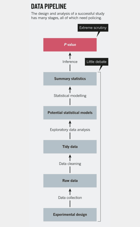
In the grander scheme of an experiment, it may seem rather trivial to make your analytical methods open and reproducible, but if you look at Figure 3 (at the end of this article), you can see that the analysis process is a key but generally overlooked area of science. In papers, our focus tends to be on what our question was, how we designed and executed a study to answer that question, and what the results are (hinged heavily on having a dreaded p-value < 0.05). The analysis section normally occupies a short section on statistical methods at the end of the methods. But it is in the analysis where we take our hard-earned data and transform it into a digestible form for others to see. It is where we make countless assumptions (e.g., do we exclude an “outlier”? Do we use a parametric or non-parametric null hypothesis test? Do we use a two-tailed or one-tailed test?) and intermediate calculations. Each of these decisions may appear minor in itself, but together they can add up to major differences in the final outcome of an analysis. In a classic paper, Gelman and Loken demonstrate the effect of small decisions on outcomes, in a process they aptly call the “the garden of forking paths.”
Are you ready to dive (or dive further) into the world of reproducible research?
Here are a few free resources to get you going:
R online
- Cookbook for R by Winston Chang
- Quick-R by Robert Kabacoff
- RProgramming by codeschool.com
- Rfor Data Science by Garrett Grolemund and Hadley Wickham
git online
Cheat sheets
Remembering the specifics of every command is impossible, so there is no shame in looking up this information. So here are links to some useful cheat sheets:
R/RStudio
- Base R (source: Mhairi McNeill via rstudio.com)
- Importing data (source: rstudio.com)
- Data wrangling with dplyr and tidyr (source: rstudio.com)
- Data visualization with ggplot2 (source: rstudio.com)
- RMarkdown cheatsheet (source: rstudio.com)
- RStudio IDE (source: rstudio.com)
git
- git (source: git-tower.com)
- gitthe simple guide (interactive)
- gitworkflow overview (source: git-tower.com)


